Inspiration & Planning

Knowing that i would like to use my fish characters and expand on it by maybe by adding birds and try to connect between sky and sea. But I’m not exactly 100% sure of how i can produce it. I’m having a ‘designer’s block‘ as they might say. Which isn’t the time to have because it’s the final project and i have to keep moving!

Going back to the links that professor Maryam have posted from our animation project, I thought of starting in this point and see where will it lead me too. One of the animated video’s have triggered my memory where i have really enjoyed a particular method and would like to try it on my own animation:

Children’s World

screen-shot-2015-11-05-at-7-08-55-pmWhat i enjoyed most is the transition of the of earth, sky to space without cutting out the scene. Simple but very interesting and i think this method would work perfectly in my animation by starting from deep sky and falls to the deep sea. During this transition there will be birds flying and fish swimming across the two scenes. The character that will connect both environment’s will be the seagull where it will dive into the sea. Simple but effective, it all depends on the quality of the animation!

Proposal For Final Project

For the final project we were given the opportunity to choose what we would like to do. As I have thought deeply and reflected on the knowledge we learned throughout the course, from illustrations to animation and 3D printing. I have decided to to stick to my kid friendly characters and expand them more and create either an animated video or a pop up children’s book. We were instructed to write up a proposal including the idea, the materials used and the 3-week timeline.

Final Poster | Reflection

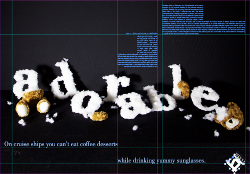
Screen Shot 2015-12-07 at 11.46.46 PMReflection:

Even though its one of the shortest project, we were able to contribute everything we learned during this semester in typography and place it on to a final poster. I was so confused and questioned the professors of why do we have to do this project? But now i get their perspective. Through project 1 – 4 we were learning the essence of typography to know and understand what is a good and what is bad, this final project is a test to see if we will contribute the knowledge into a one final poster.

Understanding the rules of hierarchy on a poster enabled a larger eureka moment on how to control an image based poster with text to hook and engage the viewer. Therefore, by creating a visual path with intervals allowed the poster to speak up by itself even though each text is not related to the other. Some of the struggles that i faced with is choosing the right intervals to create a system, what helped in this situation is continuously experimenting and building into one to reach to the final poster. However, in the beginning of the this project i was worried about the amount of negative space available which made me fill it as fast as possible; then i was able to edit down and rescale.

Overall, even though i wasn’t happy when we started the project I’m glad we have went through it because it concludes what we learned in this project. I can say that I’m truly pleased with the final outcome, and at that moment i can detect each and every decision process went through. Such an interesting way to ending Typography I. 😀

Poster | Final Critique

Final critique

Something that i didn’t mention before is the choice of color for the text, i didn’t want to add over the top colors to distract from the hook. Therefore, i maintained on the shades of grey, as the hierarchy moves in, i have darkened it slightly which i think works perfectly. I chose this iteration for the final critique because i really enjoy the way the negative space has been manipulated creating other imaginary interlocks. Some key points said during the critique:

  • try creating a path when reading the poster
  • don’t separate the sentences too far apart
  • remove the title of the arabic paragraph, not needed, distracting
  • slightly move the paragraphs, one slightly over the other
  • decrease the size of the logo

I’m happy that there are only small tweaks here and there that needs to be fixed, can’t wait for the final poster to be printed in A1!

Poster | More Iterations

Keeping in mind the rules of hierarchy for the poster and the comments from the last critique, i started experimenting more. This time i used intervals/ grids to create a system for my poster instead of throwing text in random. One point that i would like to talk about is that after committing to a specific sentence and paragraph, i have outlined them. The reason behind this decision was to ensure that the character length and design of the text won’t get out of place when rescaling the text. In this, I’m free to rescale as it as much as i can without getting worried. Here are a couple of iterations:

1 2 3By next class, we were told to have one poster for a final critique

Poster | Hierarchy rules + Inspiration

We were given a lecture by Professor Law about the hierarchy rules of a poster, i bet he was shocked from the last critique so he wanted to lay out the rules for us. In our poster there should be four levels of hierarchy and they should start off:

  1. the hook of the poster is the image created in project 2 (word) which is adorable, and used as the background. The hook should be seen from 10 – 15 meters, when one is walking by. If the viewer is hooked…
  2. creating a sense of curiosity which allows the viewer to come closer and the second level of the poster should be revealed, which is the sentence. Even though it’s a smaller scale, it should still be read from at least 5 meters.
  3. in this moment, the viewer is engaged and headed for the bate, which allows them to even come closer to the poster. Here, the paragraph should be visible and able to read the extended information.
  4. lastly, the logo with our name beside it should be placed in the poster in about 1.5 cm or smaller, as a signature or a stamp.

At this moment, i started thinking of the rules and go amazed on how i didn’t already portray it on my poster, since the information is so logical. I started by looking at inspiration posters, because even though the information is clear, i am still a visual learner. Here are some poster’s that i find interesting:

Final Poster | Reflection

FINALReflection:

Let me start by saying that even though it felt ages ago when we have first started this collaboration project with Methods and Process, but i managed to gain knowledge and learn aspects of image making in the most challenging but useful way. By having an object ready and picked out from the other course were we have dissected it verbally, but here we are dissecting it visually.

Therefore, the process of not knowing what is the final outcome but at the same time getting weekly assignments just pushes the individual to even work harder. As we tend to have a sense of curiosity, and so we try to maximize the pure experimenting to have a large variety. The more challenging the category gets, the better result you produce. I feel if we started the project of knowing that the end result will be a poster of 27 images, it would have looked boring and over planned. Knowing myself, i would plan ahead and start imagining how the poster would look like, instead of allowing the images to speak for itself.

As mentioned earlier that this whole project is a challenge because we keep getting assignment and every time we are expected to produce something out of the ordinary. Another aspect was that Noof Al Heidous and I had similar objects which was worrying that we might produce similar images, but that never happened. When we started curating the images for the final poster at first i felt like it was impossible, but i managed because i can see a huge difference between the first week assignment to the last. However combining images to create one whole poster is challenge by itself, as we have to syntactically create a relationship to formally create relationships between images.

Overall, i managed to create images that are able to communicate stronger than text itself. Hence i have produced my own person style and visual voice, where it translate my personality and my perspective towards the chosen object, the prayer beads. By centering the poster in dark with black and white images and then it transforms to light and pale colors shows that you have to dig deep to really understand the essence of one person.

Week 5 | Critique

Coming into today’s critique, i have produced two different variations, one is a good version while the other is an experimental. I had in mind that I’ll accept whatever feedback on the good version to improve it even more since i have been working so hard on it. As for the the other one, it’s a fun experimental and would just see what are their responses. As we are hanging them up, the professors told us to provide a blank paper under the posters so the classmates are able to write their critique down to which one they preferred and why.

I have never been confused as i am right know, the majority voted for the ‘experimental’ version rather than the ‘good version’ because they liked the placement of the text and color wise works better. I do appreciate my classmates feedback and comments, but my heart still falls for the good version because i know how much effort i have put on it. But still confused and I’m not sure what to do next, so i have spoken to both professors separately and coincidentally both had the same response. They said: “choose what you like best but import some of the positive feedback on the other poster to yours” < close enough. That made me feel so much better and more confident, i have to always trust my guts and that’s exactly what I’m going to do!

Week 5 | More Iterations

From my last set of iterations, i really liked how the color blocks and images are separated in a systematic way but seems random, not too controlled. Hence, i have decided that I’m going to do another set of iterations from what i liked. I feel like this way, I’m time managing myself instead of making pure experimentation I’m starting to plan my experimentation, as I’m building and improving constantly.

In this phase i started extracting keywords from my morphological chart that i have developed in Methods and Process, they keywords that i chose:

  • independence
  • peace
  • authentic
  • purity
  • identity
  • statement
  • trend

Each and every word represents my perspective towards the object. Here is what i have done so far:

A closer perspective of how I’m placing color and text over an image. As well as creating a syntactic relationship between images.

So it shows clearly that I’m struggling with color, i’ve tried vibrate and pastel, both are not working for me. I feel like it doesn’t suite the theme that I’m trying to convey on the poster. So i have went for the tints of grey on the third iteration, which is more visually appealing and makes more sense! I’m so thrilled that both professors agree because i really wouldn’t know how to handle and chose the ‘colorful’ colors for the poster.

One thing the professors pointed out is that the type is all over, in terms of scale and typeface! The placement’s were ok, they do translate the message. So without even knowing it i have chosen 4-5 typefaces for those 7 keyword with different styles like bold, italics and so on… I felt so guilty because i have thrown all what i learned in typography away! I was so focused on the images that i didn’t care as much for type. The professors told me to limit myself with 2 typefaces maximum, and have to always relate the meaning of the word to it’s style. For example, i have put ‘purity’ in all caps and in a large type point, were it has to be petite and quite!

By next class, we are asked to have two final variations printed out in A3 for one more last critique before handing in the final…

Week 4 | InDesign Workshop & Iterations

To start working on the final poster, the professor’s dedicated this class to have an  InDesign Workshop to set up the layout for the posters. At first we set up the document to be an A1 document, which another aspect to think about what placing images and the craftsmanship. Started creating grids of 7 rows and 5 columns with no gutters and margins. Afterwards using the rectangle frame tool on each block to place the images.

I have instantly thought of just playing around and placing images in trying to create some kind of system so it doesn’t seem randomized.

For each iteration i have created a system or theme, the first iteration was dividing each column to it’s similarity of category essence, gestalt, light and emotion and so on. The colors are based on trying to portray the colors of the prayer beads of tints and shades but hasn’t worked for me. The second iteration was first placing the color block, on each column opposite sides. As for the images i was more focused on the colors rather than the image, i’ve made a pattern of 2 colored columns then 2 black and white columns and so on. As for the third iteration, i have slightly moved the color blocks by shift it a block or two to the right and left, having a system but not as boring. When moving, some black and white images gathered in the middle which is another thought for another iteration.

Breaking Rules: the professors thought that most of the classmates have similar issues as me. So they have suggested to break the rules and to try placing a color block over an image, text over image, images taking over more than one block…