Final Poster | Reflection

FINALReflection:

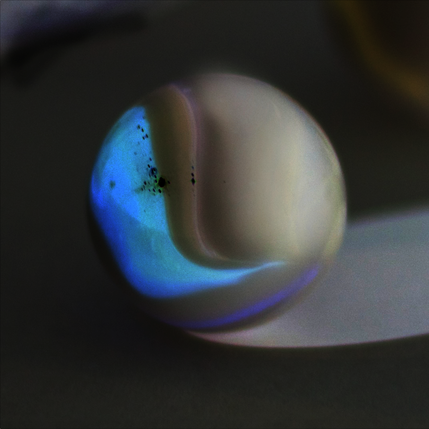
Let me start by saying that even though it felt ages ago when we have first started this collaboration project with Methods and Process, but i managed to gain knowledge and learn aspects of image making in the most challenging but useful way. By having an object ready and picked out from the other course were we have dissected it verbally, but here we are dissecting it visually.

Therefore, the process of not knowing what is the final outcome but at the same time getting weekly assignments just pushes the individual to even work harder. As we tend to have a sense of curiosity, and so we try to maximize the pure experimenting to have a large variety. The more challenging the category gets, the better result you produce. I feel if we started the project of knowing that the end result will be a poster of 27 images, it would have looked boring and over planned. Knowing myself, i would plan ahead and start imagining how the poster would look like, instead of allowing the images to speak for itself.

As mentioned earlier that this whole project is a challenge because we keep getting assignment and every time we are expected to produce something out of the ordinary. Another aspect was that Noof Al Heidous and I had similar objects which was worrying that we might produce similar images, but that never happened. When we started curating the images for the final poster at first i felt like it was impossible, but i managed because i can see a huge difference between the first week assignment to the last. However combining images to create one whole poster is challenge by itself, as we have to syntactically create a relationship to formally create relationships between images.

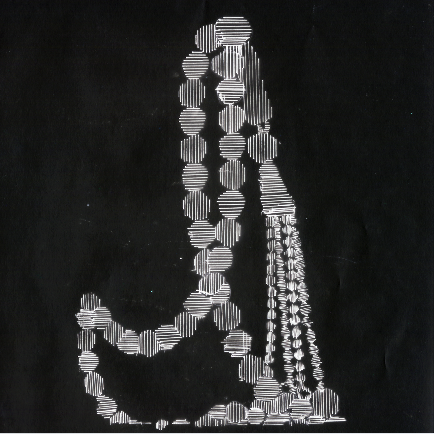
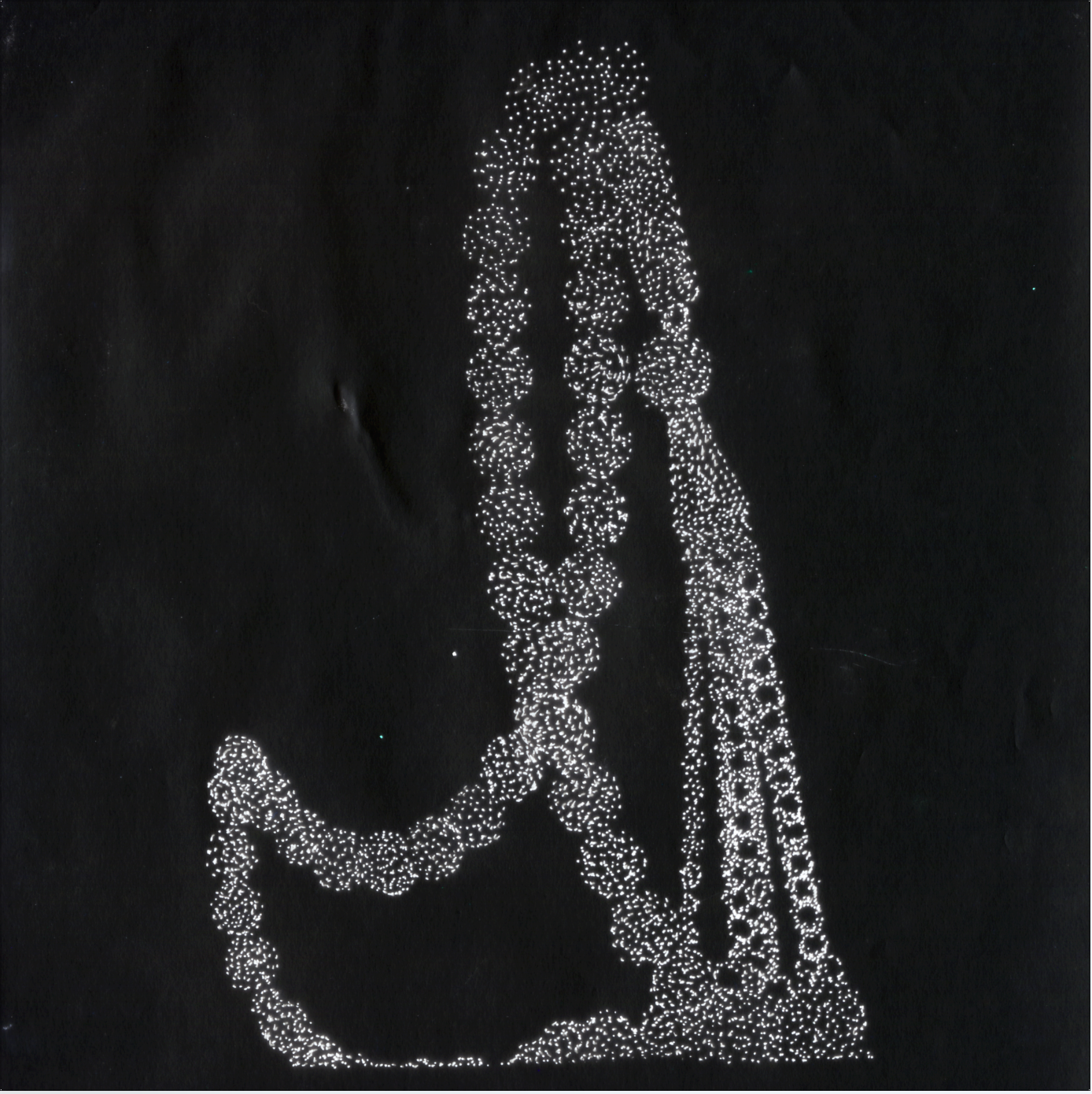
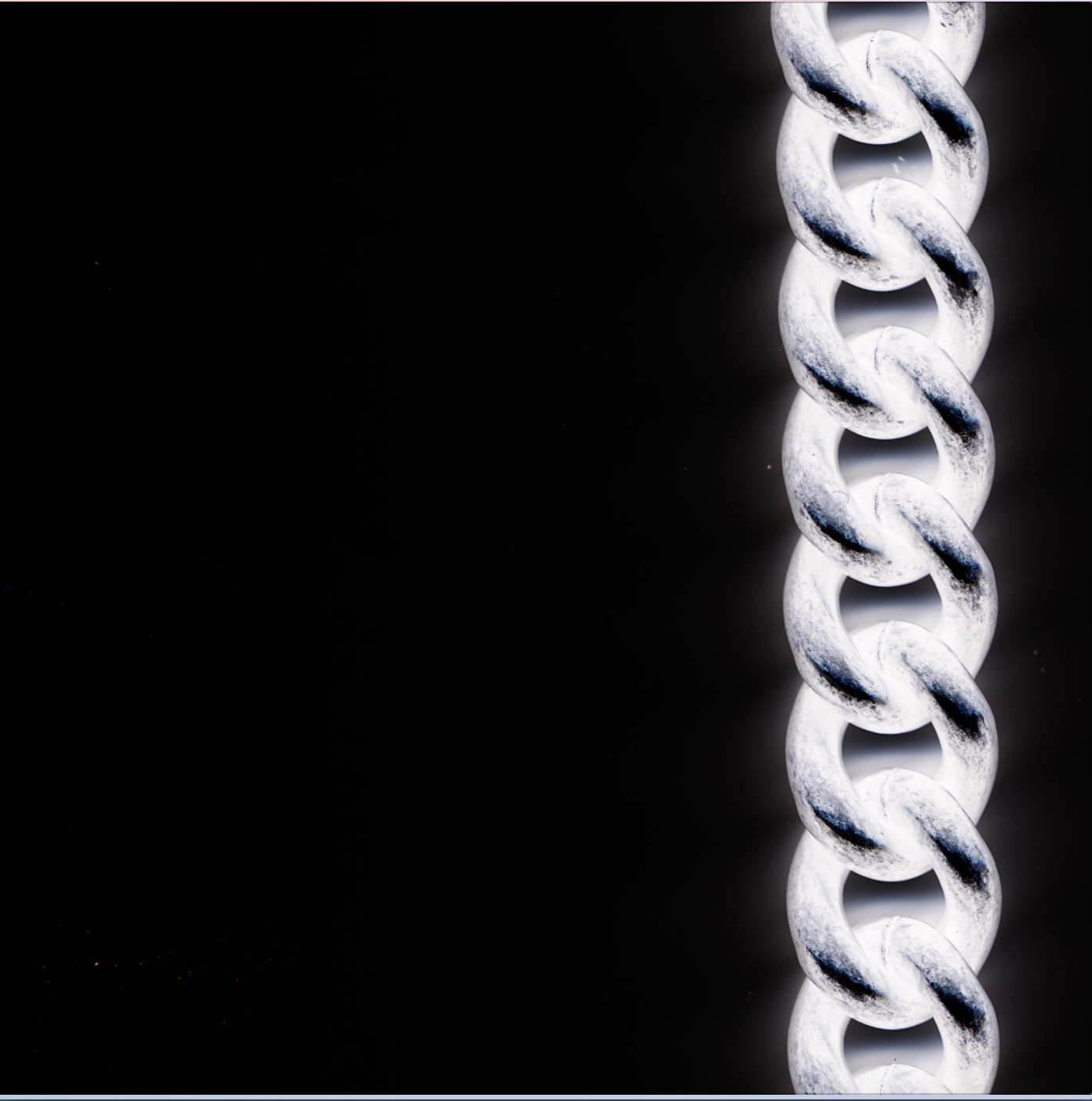
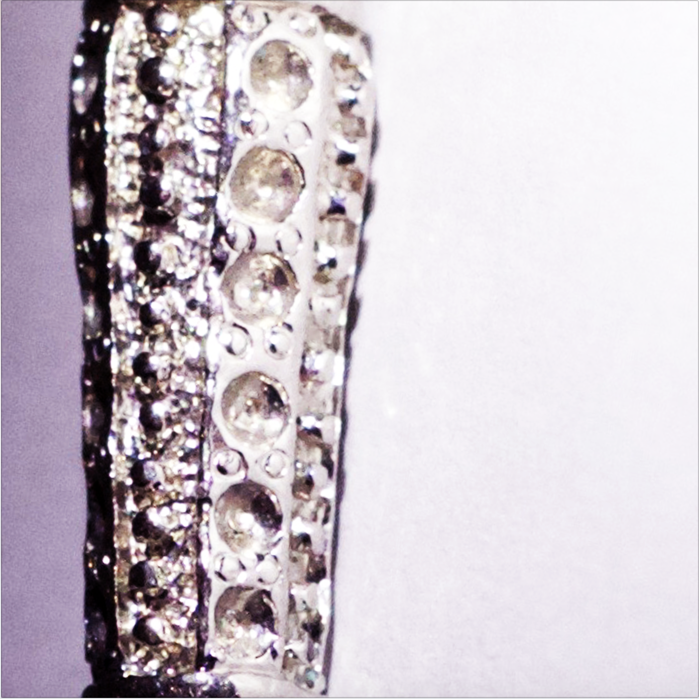
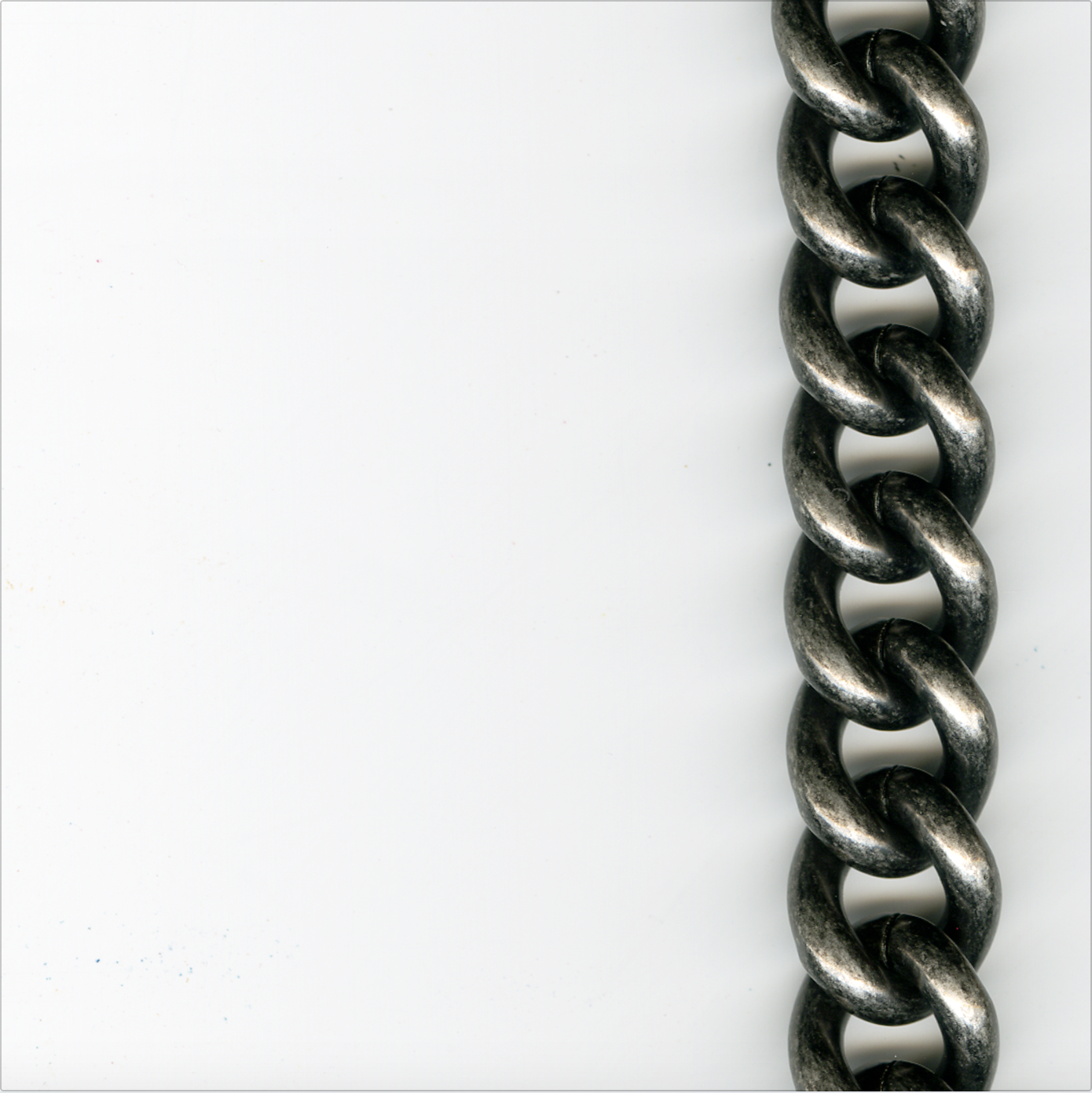
Overall, i managed to create images that are able to communicate stronger than text itself. Hence i have produced my own person style and visual voice, where it translate my personality and my perspective towards the chosen object, the prayer beads. By centering the poster in dark with black and white images and then it transforms to light and pale colors shows that you have to dig deep to really understand the essence of one person.

Week 5 | Critique

Coming into today’s critique, i have produced two different variations, one is a good version while the other is an experimental. I had in mind that I’ll accept whatever feedback on the good version to improve it even more since i have been working so hard on it. As for the the other one, it’s a fun experimental and would just see what are their responses. As we are hanging them up, the professors told us to provide a blank paper under the posters so the classmates are able to write their critique down to which one they preferred and why.

I have never been confused as i am right know, the majority voted for the ‘experimental’ version rather than the ‘good version’ because they liked the placement of the text and color wise works better. I do appreciate my classmates feedback and comments, but my heart still falls for the good version because i know how much effort i have put on it. But still confused and I’m not sure what to do next, so i have spoken to both professors separately and coincidentally both had the same response. They said: “choose what you like best but import some of the positive feedback on the other poster to yours” < close enough. That made me feel so much better and more confident, i have to always trust my guts and that’s exactly what I’m going to do!

Week 5 | More Iterations

From my last set of iterations, i really liked how the color blocks and images are separated in a systematic way but seems random, not too controlled. Hence, i have decided that I’m going to do another set of iterations from what i liked. I feel like this way, I’m time managing myself instead of making pure experimentation I’m starting to plan my experimentation, as I’m building and improving constantly.

In this phase i started extracting keywords from my morphological chart that i have developed in Methods and Process, they keywords that i chose:

  • independence
  • peace
  • authentic
  • purity
  • identity
  • statement
  • trend

Each and every word represents my perspective towards the object. Here is what i have done so far:

A closer perspective of how I’m placing color and text over an image. As well as creating a syntactic relationship between images.

So it shows clearly that I’m struggling with color, i’ve tried vibrate and pastel, both are not working for me. I feel like it doesn’t suite the theme that I’m trying to convey on the poster. So i have went for the tints of grey on the third iteration, which is more visually appealing and makes more sense! I’m so thrilled that both professors agree because i really wouldn’t know how to handle and chose the ‘colorful’ colors for the poster.

One thing the professors pointed out is that the type is all over, in terms of scale and typeface! The placement’s were ok, they do translate the message. So without even knowing it i have chosen 4-5 typefaces for those 7 keyword with different styles like bold, italics and so on… I felt so guilty because i have thrown all what i learned in typography away! I was so focused on the images that i didn’t care as much for type. The professors told me to limit myself with 2 typefaces maximum, and have to always relate the meaning of the word to it’s style. For example, i have put ‘purity’ in all caps and in a large type point, were it has to be petite and quite!

By next class, we are asked to have two final variations printed out in A3 for one more last critique before handing in the final…

Week 4 | InDesign Workshop & Iterations

To start working on the final poster, the professor’s dedicated this class to have an  InDesign Workshop to set up the layout for the posters. At first we set up the document to be an A1 document, which another aspect to think about what placing images and the craftsmanship. Started creating grids of 7 rows and 5 columns with no gutters and margins. Afterwards using the rectangle frame tool on each block to place the images.

I have instantly thought of just playing around and placing images in trying to create some kind of system so it doesn’t seem randomized.

For each iteration i have created a system or theme, the first iteration was dividing each column to it’s similarity of category essence, gestalt, light and emotion and so on. The colors are based on trying to portray the colors of the prayer beads of tints and shades but hasn’t worked for me. The second iteration was first placing the color block, on each column opposite sides. As for the images i was more focused on the colors rather than the image, i’ve made a pattern of 2 colored columns then 2 black and white columns and so on. As for the third iteration, i have slightly moved the color blocks by shift it a block or two to the right and left, having a system but not as boring. When moving, some black and white images gathered in the middle which is another thought for another iteration.

Breaking Rules: the professors thought that most of the classmates have similar issues as me. So they have suggested to break the rules and to try placing a color block over an image, text over image, images taking over more than one block…

Week 4 | Visual Anthology: A Curation of Images

Finally, we know what will the final outcome of the this project will be: “a print that exhibits a carefully curated anthology of your object reinterpretations, recreations, and redefinitions.” The past three-four weeks of continuously creating different variations of images to represent the form and meaning of the prayer beads in “expensive and dynamic manner”. By exploring the all the powerful elements that develop a successful image, now we have to engage the audience through the 35 squares in the poster that filled by 27 curated images, 7 blocks of color and 7 blocks of keywords.

The challenge now is curating over hundreds of images to only 35 at the most! How will this be possible! When curating i have to think about

  • variety, showing the best iterations
  • strength, the strongest images formally and conceptually
  • syntactic relationships, the formal relationship between images in terms of color or themes.

I started by creating an folder to start curating according the list above, i managed to limit myself to 45 images out of hundreds (i can’t even keep count!)

1

Week 3 | Silhouette & Texture

In this particular category i feel like i have achieved already most of the requirement’s from previous phases. Anyhow, in this category we are asked to create a silhouette of our object in black and white that include texture. The texture can be made either off the computer or on. Afterwards, from those images we should experiment with only 3 color variation extruded from the base of the object.

P.S; i wanted to stick to mostly black and white with hints of color, because that was makes my object more interesting and catchy.

1

Photography, extracting little bits of threads from the tassel of the ougal

2

Scanned, cropped and edited in Photoshop. It originally had those 3D colors.

3

Scanned, moving in random directions

4

Scanned, in a heart beat directions, showing movement

5

Scanned, originally had bleeds but emphasized the colors in Photoshop

6

Previous image, line texture.

7

Previous image, dotted texture.

Week 3 | Essence of Your Object

To discover the essence of the object i had to dissect mentally and formally. Thinking of the materials that make up the object, from where it comes from and how does it long look from the inside. I have to dig deep and as much as possible ignore the surface of the object. Additional, during this process we were asked to extract 5 images of literal interpretations, abstract interpretations and highly imaginative and/ or surreal. It’s so hard to differentiate each image to what category it fits! Here are they:

8

8 The magic of dripping ink on glass of whatever than inverting it in Photoshop. Produced an essence of broken glass but as well the imagination of how a pearl might look like inside.

1

From a previous image, i have played with cropping and focused on the singular strokes of movement.

13

Portraying another dimension due to the green color, outer space, moon, aliens?

9

An attempt of capturing movement again by dropping singularly pearls as they bounce back. Had multiple trials but has never work. 😦

6

A different composition but same concept of ink and water, by focusing on the ink it allowed the lens to blur the glass create magical strokes.

15

A test shot that worked pretty well, showing the richness of a singular pearl by holding it preciously. The lighting helped!

12

To enable shine in a photography, i have used a diamond earrings that have been captured in an out of focus lens.

11

Another attempt of capturing shine with different lighting and editing.

10

By using a marble and capturing it in close shot, i was able to play around with Photoshop to soften the edge and emphasize a couple of areas with the burn and dodge tool

7

Simply used the cropping tool to crop a previous image to only identify the blurred strokes.

5

Invert tool is the best!

4

A magnified image what possibly looks like the inside of a pearl bead.

3

Another image of the glass water however this time minus the ink, which conveys a surreal black whole, as it grabs your attention so deeply.

2

An attempt of showing a raw image of what materials used when creating prayer beads.

14

Cropping tool..

Week 3 | Gestalt & Minimalism

The challenge in this category is to explore gestalt though our object by only showing a quiet whisper by presenting only key parts of the object. Therefore, i started asking myself: what are the least amount of areas that are unnoticeable? In order to create a mystery for the viewer, i decided to used photography, scanning and manipulating the image in Photoshop.

Portraying mystery by using movement and faded colors to show the gestalt of the tassel.

Using a micro lens i am able to capture the small craved detail on the beginning of the tassel that are unnoticeable.

There are a 3 millimeter hook that connects the prayer beads and the tassel and that i feel has an importance part of the object. Transferred it to image trace in Illustrator to create a mystery

The simplicity of the vertical strokes of the threads conveys a quiet whisper of the object even though the actual object doesn’t have any threads.

By showing minimalism, I’ve decided to choose the most detailed area of the object and simplifying it by emphasizing the main the areas using a brush strokes in Photoshop.

By scanning a series of chains i was able to show and focus on a hidden essence of the object to a larger scale.

Week 3 | Narrative of Your Object

In order to create images the portrays a short visual narrative of the object without actually using the object itself i had to go back to my story and read it again. I started by picking out keywords that will allow to me use each image as a separate scene from my story. I have used mix media of illustrations, photography and Photoshop.

Illustrated multiple passport stamps over each other and have faded a couple to show that i visit Mecca yearly.

Designed an abstract illusion of Mecca during the Twaaf, symbolizing the circular shape of the single pearl beads of the prayer bead.

Another photographic illusion of representing pearl, half moon and beauty.

An image representing the pearl beads used for a highly fashion purposes of portraying the hand as a accessory stand.

A realistic image showing that multiple brands using pearl for fashion purposes.

Week 3

We were informed that this week will be the last phase of this project for exploring the object and creating various iterations. Once i saw the project brief, i just knew that it’s going to be hard and challenging! After a couple of visits to my professors i finally got what was asked from us, there are 5 categories and they all seem related! Its so confusing! The categories are:

  • Narrative of the object, by recreating the story of the object
  • Gestalt and minimalism, by exploring the gestalt and representing the key parts of the object
  • Essence of the object
    • literal interpretations of what the object is made off
    • abstract interpretations
    • highly imaginative/ surreal
  • silhouette and texture, the first part was being black and white, the second part is having color variations of only three colors.